Table of Contents:
Introduction
MSP Studio+ makes it easy to create polished, on-brand visuals without needing a traditional design background. Whether you're building social posts, promotional graphics, or thought leadership content, the platform gives you flexible tools to turn simple ideas into professional layouts in just a few minutes.
In this guide, you’ll find a curated set of proven design patterns you can recreate directly inside MSP Studio+. Each section walks you through a specific layout style, when to use it, and how to build it step by step using the editor. From clean, centered hero banners to more editorial and dynamic compositions, these templates are designed to help you move faster while maintaining consistency and visual quality across your content.
Think of this as your practical playbook. Pick a layout that matches your goal, follow the steps, and adapt it to your brand. Over time, you can save your favourite styles as reusable templates, making your design workflow even more efficient and scalable.
1. Centered Hero Banner
Best for: Educational posts, webinars, insights
Goal:

Structure
- Background image (Photorealistic)
- Centered headline inside a rounded box
- Subtle subheading below
- Small contact info at top or bottom
How to build
- Center-align all text

- Make the headings contrast in size. (Eg. Heading: 28px, Subheading: 9px)
- Make the main heading bold. Decrease Letter Spacing for a more emblematic look.

- Create a rounded box behind the headline. ~80% opacity should give you enough readability and still make things blend nicely. For a more on-brand look, click the colour picker and select one of your brand colours.

- Increase padding inside the box. (Eg. 6px)

- Add subtle shadow to the subheading text to increase readability. (Eg. rgba(0,0,0,0.8)). You can also experiment with white (rgba(255,255,255,0.8) if your background image is lighter.

Style tips
- Big, bold headline
- Use contrast: light text on dark background and vice versa
- Keep the subheading lighter and smaller
👉 This is your “go-to” layout. Clean, safe, always works.
Enjoyed this look? Click on the “Save as default template” to use it again later.
2. Left-Aligned Editorial Layout
Best for: Thought leadership, blog-style content, insights
Goal:

Structure
- Background image or soft gradient
- All text is aligned to the left
- No box, or very subtle background strip
How to build
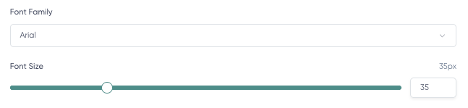
- Text different font families to match your brand. “Inter” is used in this example.

- Edit your main Heading text and use ALL CAPS for a bolder look.

- Keep subheading in normal capitalization to create contrast.

- Sizes in the example are: Heading: 38px. Subheading: 11px.
- Set both alignments to left.

- Add a subtle Text Shadow to the headline at top-left. Use the Blur handler to make the effect feel subtle and elegant.

- Add a subheading below with more line spacing
- Decrease the main heading Line Height for readability

Style tips
- Keep margins consistent. Imagine an inner square that keeps everything well-spaced from the edges.

- Feels more “premium” and editorial
👉 This one feels more “Apple / Notion / modern SaaS.”
Enjoyed this look? Click on the “Save as default template” to use it again later.
3. Framing Text + Empty Space
Best for: Product announcements, feature highlights
Goal:

Structure
- Background image
- Main heading vertically-oriented, framing the subject (left or right)
- Opposite side with a clean subheading
How to build
- Make the Heading all-caps. Font family selected in this sample: Helvetica.
- Select the main Heading and make the font size 50px.

- Select the Heading and hold the square handler. Rotate it to 90 degrees, positioning the block to the left or right.

- Pick a colour from your brand or from an element of the background. In this sample, we’re using the subject shirt colour. Use your creativity to blend things nicely in your case!

- Use the text to “frame” the subject. Play with letter spacing and line height to make the block look close and solid.

- Pro-tip: Apply Text Shadow creatively. Pick your brand colour, for example, and make it blur (50px) behind the text. This will create a soothing gradient effect that will make your text pop while keeping it tied to your brand. Play with the offset to control where the shadow is projected.

- Make the Subheading significantly smaller. The increased contrast will make the focal point and hierarchy clear. We're using Helvetica 14px.
- Using the same brand colour you picked on Step 6, enable a Text Background.

- Keep your logo elegantly placed on the opposite side.
Style tips
- Creates balance and hierarchy
- Avoid crowding the canvas
- Works great with most backgrounds
👉 Feels more “designed” without being complex.
Enjoyed this look? Click on the “Save as default template” to use it again later.
4. Highlight Card Style
Best for: Tips, stats, quick value content
Goal:

Structure
- Background image or color
- One floating card (box) in the center or slightly offset
- All content inside the main card
How to build
- Make the main Heading big and bold.
- Make the lines sit tight together.

- Enable the Text Background. Pick a suitable colour from the background and make it subtly sit behind the text. Play with Opacity so it’s elegant but still present. Boost Padding to create enough room on all sides.

- For the extra fancy look, break the rules: Enable Text Shadow too. Make the secondary colour cast a nice effect over the card.

- Make the Subheading fit in two lines, if possible.

- Place headline + subheading inside the main Heading “box”.
- Feel free to place logos and contact information on Center Top or Bottom.
Style tips
- Rounded corners = more modern
- Strong contrast between the card and the background
- Keep content compact
👉 This is the easiest way to instantly make things look “designed.”
5. Glowing Stack Layout
Best for: Promotions, announcements, offers
Goal:

Structure
- Top: small label or contact info
- Middle: large headline
- Bottom: subheading or CTA
How to build
- Center everything vertically

- Move logo and contact information to the bottom area. Click and drag them – don’t forget the imaginary margin!
- Use moderate spacing to separate elements.
- A larger and bolder Heading requires the lines to sit closer together. Font family used in this sample’s Heading: Verdana.

- Apply some Text Shadow to the main heading. You can use one of the colors from your background to create a seamless glowing effect.

- Pick a different font family for the Subheading to create visual contrast. Choose an alternative color for your subheading. Make sure your color pick has enough contrast with the background image.

Style tips
- Use spacing wisely
- Keep it clean and structured
👉 This creates a strong visual flow without needing extra design elements.
6. Editorial Cartoon
Best for: Promotions, announcements, offers
Goal:

Structure
- Bottom: small label or contact info
- Middle: large headline
- Overlapping: subheading
How to build
- Make Heading and Subheading texts left-aligned.

- In this sample, the fonts chosen are “Helvetica”. Heading: 20 px; Subheading: 9 px.
- Click and drag the logo and contact information to the bottom area.
- Use moderate spacing to separate elements.
- Apply a Text Background to both Heading and Subheading. Set different shades of the colors in the background and have an opacity around 80%. Adjust the Padding so there’s enough room around the text on both elements.

- Position them so they slightly overlap. That will create a nice blend with the two colors.
- Have the two blocks slightly offset to create some asymmetric balance.

Style tips
- Use spacing wisely
- Keep it clean and structured
- Pro-tip: Shadows don’t need to be always “Black”. On lighter backgrounds, sometimes a white shadow under a text increases readability without fuzzing the graphic.

👉 This creates a fun visual that still inspires trust.